
Full Source at GitHub : AdvCustomValidationComponent
Validation is very important feature of application which allows to data entry (allows to enter data in application) as invalid data can leave application in inconsistent state, invalid date entry crash application and if data is not validated it can allows injection attacks on application. In Web application validation can be done at server side (i.e. on server like IIS, apache in language C#, PHP etc.) and at client side (i.e in browser windows using javascript).
Here, following post is about validation in Angular 2 application , which means its about validation on client side not about server side. Angular framework allows to do validation following two way
Custom Validation Component
Let's first create validation component and make use of it in application. For fresh start of application follow this post : My first Angular 2 app - tutorial. After creating application create shared module in application by running below command in integrated terminal of visual studio code.
Shared module is where custom validation component will resides , as custom validation component is dumb and its going to be used by multiple features in application. Run command on integrated terminal create
custom-input.component.html
Above is modification done in component html, some of the points to note in html are
Above is Component Typescript file , code in file handles all the backend logic to control Component invalid/valid state, putting red border around control when there is error and displaying error message when control is in invalid state.
Important thing to not here is InputRefDirective , which access input control. Below is code for input-ref directive.
input-ref.directive.ts ( created by ng g directive directive/InputRef )
Important part of input-ref directive is, with help of constructor injection (by using angular framework injection) NgControl get injected in the input-ref directive. By doing that directive class get access to input control.
So its end of creation of validation component and its related directive. Now let's see how to use it in application.
app.component.html
Reactive Form
Component.ts for Reactive form only
code below create form reactive way - point to note here no much code to access control and display error (discussed below in advantages).
Template Driven Form
It's not full template of application component code, but it part of template which uses Custom validation component in both ways Reactive Form and Template Driven Form way. So not much change in both way, except change forced by reactive form approach and template driven form approach.
Not much in app.component template to discuss as already discussed before in post. app.component template make use of custom validation component and pass all required input values (label, info and validation error).
Below is image of final form after doing all changes
Advantage of using Custom validation component
Wrapping up
Custom validation control is easy and simple to use. It makes use of some advance stuff like ng-content, directive to get input control under the hood and encapsulate thing in it. Once control included in application it reduce amount of validation code & effort to write validation code in every data entry form.
Full Source at GitHub : AdvCustomValidationComponent
Validation is very important feature of application which allows to data entry (allows to enter data in application) as invalid data can leave application in inconsistent state, invalid date entry crash application and if data is not validated it can allows injection attacks on application. In Web application validation can be done at server side (i.e. on server like IIS, apache in language C#, PHP etc.) and at client side (i.e in browser windows using javascript).
Here, following post is about validation in Angular 2 application , which means its about validation on client side not about server side. Angular framework allows to do validation following two way
- Template Driven Form
- Reactive Form
Custom Validation Component
Let's first create validation component and make use of it in application. For fresh start of application follow this post : My first Angular 2 app - tutorial. After creating application create shared module in application by running below command in integrated terminal of visual studio code.
ng g module shared.
Shared module is where custom validation component will resides , as custom validation component is dumb and its going to be used by multiple features in application. Run command on integrated terminal create
ng g component shared/custom-inputcustom validation component.
custom-input.component.html
 <div class="form-group" >
  <label class="control-label">{{label}}</label>
  <br />
  <div [ngClass]="{'has-error':isError}" >
    <ng-content></ng-content>
    <ng-container *ngIf='isError'>
      <span class="text-danger" *ngFor="let msg of errorMessages"> {{msg}}</span>
    </ng-container>
  </div>
</div>
Above is modification done in component html, some of the points to note in html are
- ng-content - which is very important tag in this html and important for validation component. This Angular 2 Framework tag allows to push any content in html when component loaded. For example:
<custom-input>
  <input inputRef class="form-control" type="text" />
</custom-input>
when above code written in component it will become like this,
so input element put inside in ng-conent when component loaded in html page. - inputRef its directive associated with input element, that intrun allows to access input element in comoponent typescript (more discussed below).
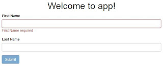
- When custom component render in browser it look as below:

So, html tags in component will create structure above as shown in below image

image above explain all the tags which made up component template. Just to note few points- Border around the text box controls comes when text box becomes invalid. Border to textbox get applied by 'has-error' class , which get applied isError becomes true (in which case it becomes true described by code in typescript file below),
- "First Name Required"- this message comes when there is error i.e. in this image it error related to required validation. This passed as input to component described below
- label,(First Name) - will come from typescript associated with component template. This passed as input to component described below.


@Component({
  selector: 'custom-input',
  templateUrl: './custom-input.component.html',
  styleUrls: ['./custom-input.component.css']
})
export class CustomInputComponent implements OnInit {
  @Input() label: string;
  @Input() validations:  { [index: string]: string};
  @Input() info: string;

  @ContentChild(InputRefDirective) input: InputRefDirective;

  get isError() {
    return this.input.hasError;
  }

   get errorMessages() {
    const errors = this.input.errors;
    const messages = [];
    const keys = Object.keys(this.validations);

    keys.forEach(key => {
        if (errors[key]) {
          messages.push(this.validations[key]);
        }
      });
    return messages;
  }

  ngOnInit() { }

  constructor() { }
}
Above is Component Typescript file , code in file handles all the backend logic to control Component invalid/valid state, putting red border around control when there is error and displaying error message when control is in invalid state.
| Type | Name | Description |
|---|---|---|
| Input | ||
| label | display label text for control E.x. First Name in above image | |
| validations | its indexed object hold validations associated with input tag of component E.x. {'required' : 'First Name required', 'minlength': 'Minimum lenght is 3 char'} Note: indexed property name must need to match with type of validation E.x. 'required' key match with required validation |
|
| info | ||
| variable | ||
| input | this component variable allows to get access to input control (which replaces ng-content in template of component) associated with component, for example above image in this case 'input textbox'. | |
| Properties | ||
| isError | component property which find input element (with help of input directive) and get element has error or not, which in turn helps to put red border around input control | |
| errorMessages | component property which access errors associated input element (with help of input directive) and with help of input property validations object find proper error messages and return to display all. |
Important thing to not here is InputRefDirective , which access input control. Below is code for input-ref directive.
input-ref.directive.ts ( created by ng g directive directive/InputRef )
import { Directive } from '@angular/core';
import { NgControl } from '@angular/forms';

@Directive({
  selector: '[inputRef]'
})
export class InputRefDirective {

  constructor(private formControl: NgControl) {
  }

  get hasError() {
    return this.formControl.dirty && this.formControl.invalid;
  }

  get errors() {
    if (this.hasError && this.formControl.errors) {
      return this.formControl.errors;
    }
    return '';
  }
}
Important part of input-ref directive is, with help of constructor injection (by using angular framework injection) NgControl get injected in the input-ref directive. By doing that directive class get access to input control.
| Type | Name | Description |
|---|---|---|
| Properties | ||
| hasError | property return true (when control is dirty and invalid state) or flase , to indicate there is error or not | |
| errors | property returns list of errors associated with input control |
So its end of creation of validation component and its related directive. Now let's see how to use it in application.
app.component.html
Reactive Form
<form class="needs-validation" [formGroup]="detailForm" novalidate>
    <custom-input [label]="'First Name'" [validations]="{required:'First Name required'}">
      <input inputRef class="form-control" formControlName="firstName" type="text" />
    </custom-input>
    <custom-input [label]="'Last Name'" [validations]="{required:'Last Name required'}">
      <input inputRef class="form-control" formControlName="lastName" type="text" />
    </custom-input>
    <div>
      <button [disabled]="detailForm.invalid" type="button" class="btn btn-primary">Primary</button>
    </div>
</form>
Component.ts for Reactive form only
code below create form reactive way - point to note here no much code to access control and display error (discussed below in advantages).
export class AppComponent implements OnInit {
  title = 'app';
  detailForm: FormGroup;

  constructor(private fb: FormBuilder) {
    this.createForm();
  }

  ngOnInit() {
  }

  private createForm() {
    this.detailForm = this.fb.group({
      firstName: new FormControl('', [Validators.required]),
      lastName: new FormControl('', [Validators.required]),
    });
  }
}
Template Driven Form
<form class="needs-validation" #detailForm="ngForm" novalidate>
    <custom-input [label]="'First Name'" [validations]="{required:'First Name required'}">
      <input inputRef class="form-control" [(ngModel)]="firstName" name="firstName" type="text" />
    </custom-input>
    <custom-input [label]="'Last Name'" [validations]="{required:'Last Name required'}">
      <input inputRef class="form-control" [(ngModel)]="lastName" name="lastName" type="text" />
    </custom-input>
    <div>
      <button [disabled]="detailForm.invalid" type="button" class="btn btn-primary">Primary</button>
    </div>
</form>
It's not full template of application component code, but it part of template which uses Custom validation component in both ways Reactive Form and Template Driven Form way. So not much change in both way, except change forced by reactive form approach and template driven form approach.
Not much in app.component template to discuss as already discussed before in post. app.component template make use of custom validation component and pass all required input values (label, info and validation error).
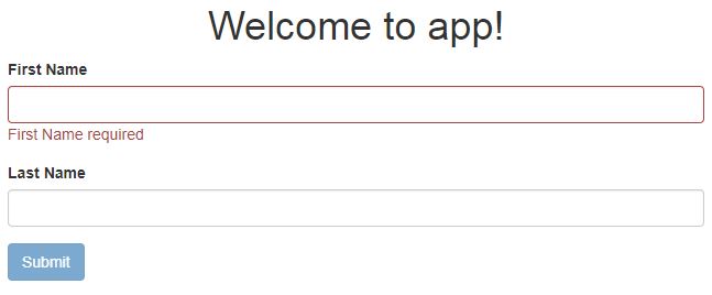
Below is image of final form after doing all changes
Advantage of using Custom validation component
- Less code in component template,
Template driven from
 <label class="control-label">First Name</label>
  <input
  type="text"
  name="firstName"
  [(ngModel)]="firstName"
  minlength="2"
  required>

<div *ngIf="firstName.errors?.required && firstName.touched && firstName.touched"
class="label label-danger">
  Name is required
</div>
<div *ngIf="firstName.errors?.minlength && firstName.touched && firstName.touched"
class="label label-danger">
  Minimum of 2 characters
</div>
Reactive fromcomponent.ts this.detailForm = this.form.group({ firstName: [null, Validators.compose([Validators.required, Validators.minLength(2)])], }); component.html <label class="control-label">First Name</label> <inpu. type="text" name="firstName" [(ngModel)]="firstName" minlength="2" required> <div *ngIf="detailForm.get('firstName').errors?.required && detailForm.get('firstName').touched && detailForm.get('firstName').touched" class="label label-danger"> Name is required </div> <div *ngIf="detailForm.get('firstName').errors?.minlength && detailForm.get('firstName').touched && detailForm.get('firstName').touched" class="label label-danger"> Minimum of 2 characters </div>
If there is no custom validation component , in both the way (Template driven or Reactive way) one need to write down separate div for displaying each error input control has, for example (div for required error and div for minlength).
But with custom validation control, there just need of passing validations in validations-property of control and it will take care of it.<custom-input [label]="'First Name'" [validations]="{required:'First Name required', 'minlength':'Minimum of 2 characters'}"> <input inputRef class="form-control" [(ngModel)]="firstName" name="firstName" type="text" /> </custom-input>
Event there is no need to write extra label tag for displaying label for input control. This also taken care by custom validation control label-property. - Second major difference is, custom validation control encapsulate code of validation in one place only for full application. That means there is no need to write validation code in template in each and every data entry form.
Wrapping up
Custom validation control is easy and simple to use. It makes use of some advance stuff like ng-content, directive to get input control under the hood and encapsulate thing in it. Once control included in application it reduce amount of validation code & effort to write validation code in every data entry form.
Full Source at GitHub : AdvCustomValidationComponent
No comments:
Post a Comment